-p-130x130q80%201.png)
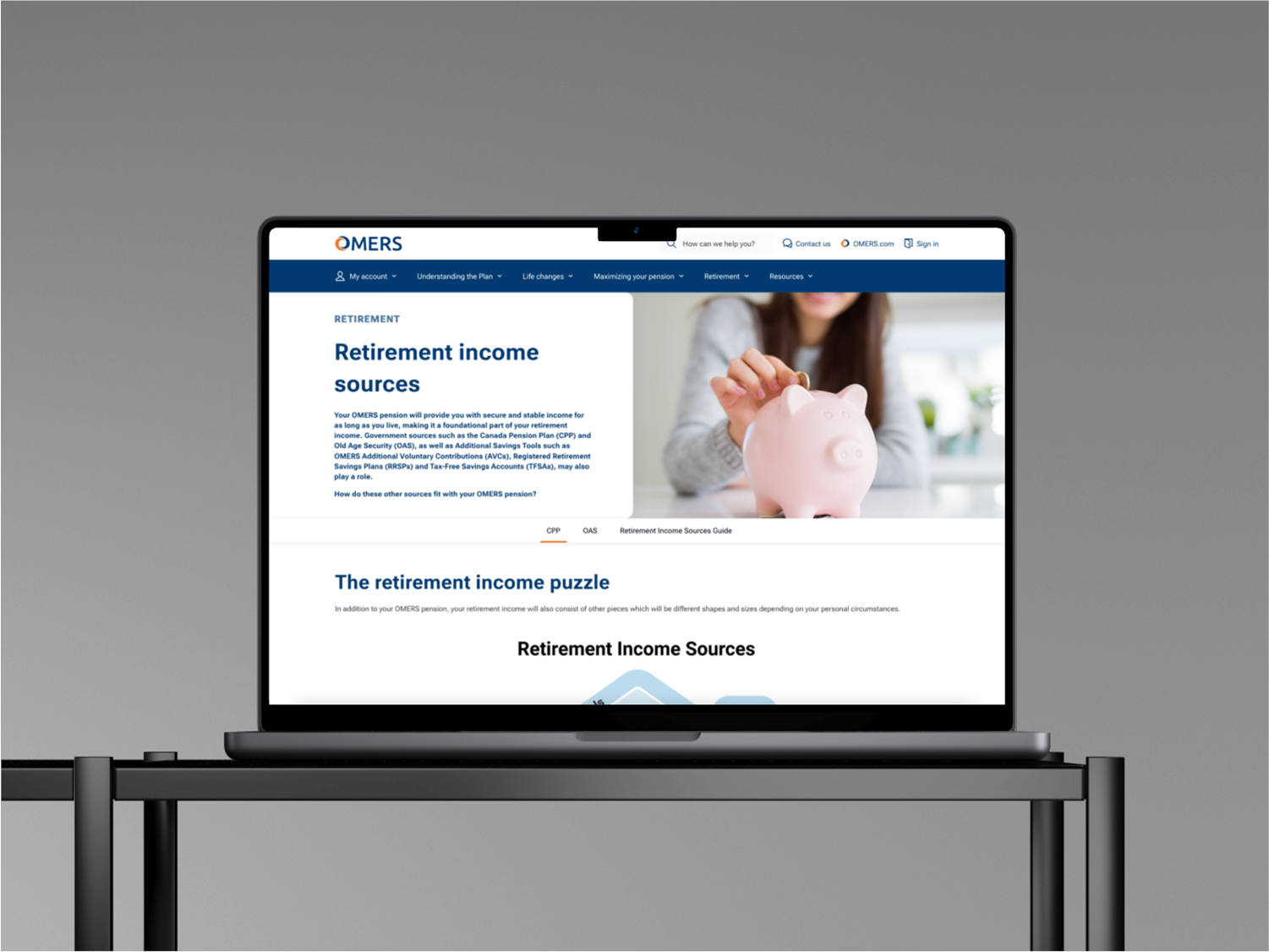
The Global Communications team was rolling out a new color scheme across the myOMERS digital portal. The UX Design team raised concerns that changing the primary button color from orange to blue might make key actions harder for users to notice. Because these buttons drive important interactions, like account management and transactions, it’s crucial that they stand out visually, both to support a smooth user experience and to maintain accessibility for all users.
To quickly inform design decisions, we conducted an unmoderated study which allowed for a faster turnaround compared to moderated sessions. A link to the survey was sent to active and retired members via email.
Participants were shown mockups of the primary button in both orange and blue and asked to provide feedback on:
The study leveraged the Sprig platform to deploy the survey and collect user feedback. Participants provided feedback using a combination of multiple-choice questions to indicate which button they noticed first and which they preferred, as well as open-text responses to explain their reasoning and perceptions.
The study revealed clear patterns:
Based on the research:
The findings were compiled into a concise UX report and shared asynchronously with stakeholders. The report summarized key insights, data visualizations, and participant quotes to clearly communicate the rationale behind the recommendation.
As a result, the team decided to keep the orange primary button, ensuring that key actions remain visually prominent and accessible.